
What is the big Mobile Friendly update; Mobilegeddon?
I know a lot of search marketing gurus are running around saying the sky is falling… I’ve seen some half-truths like:
- Mobile search traffic has grown to represent over 50% of total search volume in some markets!
- This is the biggest change to the Google algorithm in a decade!
- If your website is a mess for mobile expect to be dropped from search results on the 21st!
- etc..etc..
These partial truths are more marketing than honest advice, but there are some honest points making it out too:
- This update will only influence mobile search not desktop search.
- Sites will not be ‘penalized’ in the same way as unnatural links or other issues.
- We’ve been hearing about this since 2013 and earlier.
Because Caorda has known about this for so long, most of our clients are well aware of the value of making their websites mobile friendly, but nobody was sure how Google was going to proceed. In fact Google has dabbled with a few solutions in beta testing including a pair of icons.
At this point however it’s clear that the change will be a simple text tag that indicates a site is mobile friendly:
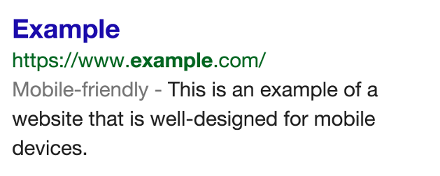
This is a big example image but Mobile Friendly Search Results will not be a big change.
We can expect that mobile users will start to instinctively favour links that are marked as mobile friendly, and that means there is now additional value in embracing mobile, something that was already a good strategy.
How to get the Mobile Friendly tag:
Google has given us a handy list of things that they are openly looking for when recognizing a site as “mobile friendly“:
- Avoid using software, like Flash, that does not work on common mobile devices
- Use readable text sizes that don’t require user zooming
- Keep content size appropriate to the screen to eliminate scrolling
- Ensure links are spaced far enough apart to allow easy tapping without mistakes
These are some really simple rules that honestly improve the mobile web experience. If developers follow these rules while building a site it really helps, but making an existing website follow these rules can be a huge hurdle depending on how complex your existing site is.
Fixing Mobile Issues
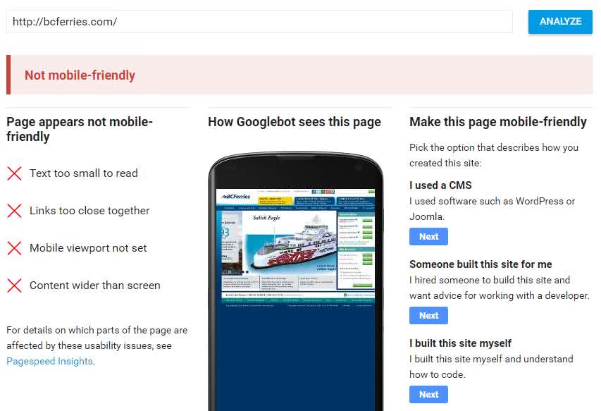
If you only have one specific mobile device to test with you might be ignoring issues that only show with other mobiles. So how can you ensure that you’re troubleshooting responsive web design correctly?
Google has setup a Mobile-Friendly Test site that not only helps you spot mobile problems, it also tries to provide somewhat generic advice.
If you haven’t started to embrace this ongoing change and haven’t even decided on a strategy then you might want to skip ahead to this Google page discussing various mobile formats.
In the past there had been some seemingly biased approval of using a unique URL and a subset of content from your main website as the preferred approach. This was both easy for Google to detect/understand, and offered the most options for fully supporting mobile. At this point they appear to have reversed that bias and if anything they are suggesting trying responsive web design over separate URLs.
Whatever approach is selected a website needs to be very clear to Google when mobile has been detected and the content is specifically mobile friendly.
Using a CMS to get Mobile Friendly
When utilized properly, most Content Management Systems (CMS), like WordPress, are capable of easily upgrading to a mobile responsive theme which can be enough to flag the site as mobile friendly.
If you have content on your site that you are not keeping current because it’s too hard to update, a CMS could also help you with getting regular updates to your web content.
The only caveat with this approach is that you must be prepared to keep your CMS updated, including updating plug-ins, and applying security patches. Caorda not only tackles updates for our clients but we also alert our customers when updates are particularly urgent.
Trusted Solutions
Caorda has years of experience with responsive web design, content management systems, and search marketing. Our own Caorda Content CMS is mobile friendly and we have published a large number of mobile friendly websites using other tools such as WordPress, Umbraco, Drupal, etc..
While updating the website layout for mobile you may also want to have our graphic design team take a look at your website images. Our artistically talented designers can provide new ‘cleaned up’ (or re-designed) versions of your site images that are available in multiple resolutions to support high resolution displays.
For some clients we can also add schema markup to your pages and templates that will help explain your content to the search engines. When search engines are able to fully understand your web content they can enable enhanced search results:

Clients who want to embrace mobile users and drive traffic with enriched search results can count on our SEO knowledge and web marketing experience to make it happen.
If you are interested in speaking to us about getting your website mobile friendly, adding extra markup to generate enhanced search results, or just upgrading to a CMS to make life easier, please use our web design inquiry form.