Is your website optimized for all types of eyesight?
There’s more to designing a useful website than meets the eye. We tend to forget that there’s a huge audience on the web who don’t see colour and contrast in the same way as the majority. If you ignore the needs of this audience, you could be losing out on potential clientele – particularly if the products and services you sell cater to the elderly or to people with physical challenges.
As the world’s population continues to age and our dependency on information sharing becomes increasingly web-based, we need to be aware of the fact that more and more of our elderly populations will be versed in Internet technology. Unlike people currently in their eighties or nineties – who grew up depending on printed media to stay abreast of current events – you – and possibly even your parents – don’t fit that mould. If your business provides products and services used by people over sixty and are not yet catering to the ‘baby boomers’, you certainly should be. Leading the way are websites like Amazon, eBay and Walmart that are already on top of their marketing strategies for an aging customer base.
On another front, those who are physically challenged will certainly be staying in the comfort of their own home to do all their grocery shopping from their computer, as online shopping and home delivery continues to grow more popular year by year.
That being said, one cannot afford to ignore website design and development tactics that benefit the visually impaired.
Doing The Numbers
According to the World Health Organization, approximately 1.3 billion people across the globe live with some form of vision impairment (source) – 7.3 million in America alone. However, the term ‘colour blind’ doesn’t actually mean that people see the entire world in black and white. Only about 0.00003% of the world’s population suffers from total colour blindness, otherwise known as Monochromacy. The other 99% can actually see colour; they just don’t see it in the same way that the majority of humans do. Because of this, the term colour vision deficiency (CVD) is more accurate.
Using the United States as an example…
According to the American National Eye Institute and other sources, an estimated 3.4 million (3%) of Americans aged 40 years and older are considered legally blind. The leading causes of vision impairment and blindness in the U.S. include diabetic retinopathy, age-related macular degeneration (AMD), cataracts, and glaucoma. Color-blindness.com states that around 0.5% of women (1 in 200) and 8% of men (1 in 12) suffer from some form of CVD.
And according to Marilyn Schneck, a scientist with the Smith-Kettlewell Eye Research Institute in San Francisco, many people lose their ability to clearly distinguish certain colours as they age, with losses typically starting around age 70 and getting worse over time. The lenses of their eyes can become yellowish, causing them to see as if they were looking through a yellow filter (source).
By 2050, people over age 60 are expected to account for 25-29% of the U.S. population.
(Source: Bored Panda)
Colour and Light Contrast
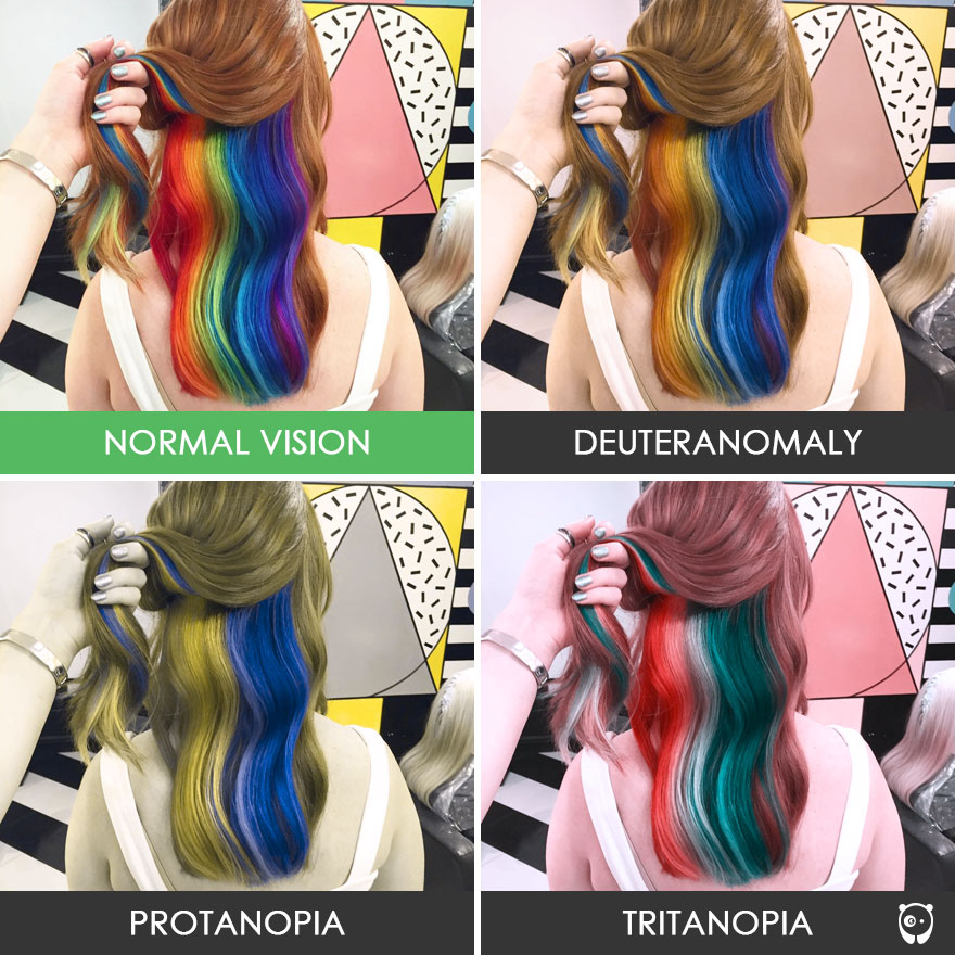
People with deuteranomaly and protanomaly are collectively known as red-green colour blind and they generally have difficulty distinguishing between reds, greens, browns and oranges. They also commonly confuse different types of blue and purple hues. Deuteranomalia tends to make everything look a little faded, protanopia makes everything seem a little green, and tritanopia gives things greenish-pink tones.
When designing a website for an audience commonly comprised of those with vision deficiencies, it’s wise to abide by the structures outlined in the Web Content Accessibility Guidelines (WCAG), which works to help make web content more accessible to individuals with disabilities.
Here are some interesting examples of how some people see the world:
- https://www.boredpanda.com/different-types-color-blindness-photos/
- http://www.colourblindawareness.org/colour-blindness/living-with-colour-vision-deficiency/
It is important to choose images carefully for a website visited regularly by people with colour vision deficiency. Here are a couple examples of photos as seen by people with varying kinds of CVD:
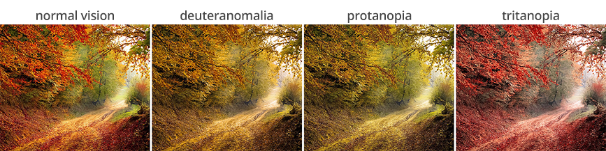
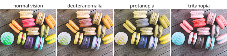
(Note: everyone’s computer colours are calibrated differently, and so these tests cannot be 100% accurate.)
As you can see, the second example might be a safer choice; not only does it feature a set of colours that a wider audience can see, but it has superior levels of light and dark contrast, as well as colour hue contrast.
Wondering how your eyes measure up? Try a couple of online colour tests:
Green and red are the colours that visually impaired people struggle with the most. (So if your company sells Christmas supplies, good luck.) If your text links are red or green, make sure they are underlined. In fact, if your website caters to the visually impaired or to an elderly community, text links should always be underlined.
If your corporate brand is green or red, make sure there are plenty of contrasting dark and light tones throughout your website pages. Try not to use ‘green on green’ or even ‘blue on green’ in your design; those colours are too close to each other on the visual colour spectrum and may not provide sufficient contrast.
If you’ve made all the buttons on your website red in an effort to help grab attention, you might want to reconsider. If a user accidentally misses a field in a form they’re filling out, and the only warning they receive is a tiny red asterisk at the beginning of one of the fields, they may never see the problem – and you may lose a sale. A better solution would be to apply a thick border to the missed field. Bottom line: don’t rely on colour to communicate your message.
On every website, it is extremely useful to use an organized, linear layout with a clear hierarchy of content. You should avoid animated text and backgrounds if they reduce readability. A small, thoughtful colour palette with plenty of contrast will score you far better points from the standpoint of usability. Google has focused on boosting website UI and UX for years – which is one of the reasons why your website might be ranked higher in searches if its information is usable by a wider audience.
Here’s a link to a Google Chrome extension that allow you to view any site in grayscale » (open in Chrome)
Even though complete colour blindness (Monochromacy) is rare, this tool provides a handy way to gauge your website’s contrast levels.
Designing for the Visually Impaired
Beyond catering to specific types of CVD, other factors should also be considered. The ‘tone-on-tone’ technique has become a trendy, artistic way to design website elements in recent years. In some situations, it works perfectly well and it’s a nice way to add texture to a space – sort of like a watermark. But, when using this effect for text, this approach makes it difficult for visually impaired readers to find the information they need. If your website’s design needs to stick to a singular colour palette in order to obey the rules of your brand, just make sure the contrast between various colour shades is high enough.
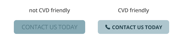
To account for a wider range of visual abilities, text buttons, notices, and other calls to action intended to request a direct interaction should use highly contrasting colours. Try to avoid using colour combinations easily confused by CVD users (red and green, blue and yellow). Also, it helps to integrate clean iconography related to the action’s purpose.
How does your website stack up?
Whether you see the full spectrum of colours or not, here are some standard guidelines that all successful websites should follow:
If it’s there, it needs a purpose.
Regardless of how you interpret colour, if you feel the need to draw attention to something on the page – such as accenting some text like ‘Visit our product page to learn more’ – that text needs to do something. Just sitting there looking pretty wastes a valuable opportunity, so it may as well be a button. Are you featuring a photo of one of your staff members on the home page? That photo should link to the staff member’s bio page. Are you displaying a blog feed on your page with featured images? Any related images and ‘read more’ buttons need to link you to those individual posts.
If it functions, show it.
Everything on a website that functions as a link – whether it’s a text link, a button, an icon or a feature box – needs a hover state. That means that, as you move your mouse over it, you need to be able to see that it’s meant to do something. This is not only a helpful tactic to assist your users in navigating through the website, but it is crucial for assisting those who are visually impaired. Also, keep in mind that seniors or people with inferior eyesight depend on having website functionality be as obvious as possible. Some trendy sites tend to use more subtle hover effects, such as a dark grey button that changes to a slightly lighter shade on hover, but while it may be glamorous and tasteful, it is not helping your user. Thus, it is highly important for your designer to know what sort of audience they will be catering to before they begin the design process.
Size Matters
Even if not many of your customers suffer from visual impairment, everyone’s eyesight tends to deteriorate as we age. Providing your online audience with the ability to increase the font size on your website is a very helpful feature. Most Internet users are accustomed to using the ‘zoom’ feature in their browser, but this action tends to increase the size of more elements on the page than are necessary. In most situations, it’s only important to increase the size of text – not the logo and page imagery. Your website developer can easily create additional stylesheets, each with its own set of custom font sizes – giving your users control over the varying levels of text – to make their experience more comfortable. Caorda has implemented this feature on multiple websites.
Don’t Just Letter Be
Taking things a step further, special attention should be taken when deciding how to lay out your page text, in order to make it more easily readable. Things like tracking (the space between words), kerning (the space between individual letters), leading (the space between lines of text), and line width (most readable at 30-40 characters) all help to improve the reading experience. Additionally, to aid readers with visual impairments, italics should be avoided, bold lettering for links is advisable, background textures and imagery should either be avoided or used minimally, and shadow effects should be avoided for lettering (as they change the shape of the letters).
Thin font weights have become popular in the design world over the past several years. Just remember that not every browser renders font weights the same way – and not all eyes can read them as well.

Still in the Dark?
The design and UX (user experience) considerations above will help you provide a better online experience for your visually impaired customers, but what happens if you need to cater to a completely blind audience? Well, the design and colours won’t matter in that case, but what will are the ways in which you lay out your page and label all the elements.
People who are completely sight challenged can still use the Internet, but they depend on a screen reader to speak out all the content on the page using a Text-To-Speech (TTS) engine to translate on-screen information into speech, which can then be heard through speakers or earphones. Also, in addition to speech feedback, some screen readers are capable of providing information in Braille.

Getting The Picture
Images should include alt tags (alternate text) at all times. When a screen readers makes its way to an image on a page, it speaks the image’s alternate text. For example, if your page features a photo of a woman with a paint-splattered face, the code the screen reader sees is: <img src=”/woman-painted-face.jpg” alt=”Woman with paint-splattered face” />, but the part it speaks is the Alt tag. It is crucial SEO tactic to include Alt tags on all images on your website – wherever possible – as it helps search engines understand the context of the image. Google rewards websites that properly utilize alt tags by placing them closer to the top of search results.
Additionally, links and buttons should include alt tags, and the functioning text should say more than merely ‘click here’. You need to explain what the link is and where a user will end up after clicking it.
Thank you for following along with this exciting insight into web sight. We hope we’ve shined a bit of light onto this colourful topic. As always, just reach out if you have any questions!