
Is it time to breathe new life into your logo, or your whole brand?
There are many reasons why companies refresh their brand. If you’ve been in business a long time, you already know how situations arise involving growth, change of focus or new ownership, inevitably resulting in the need to rise to meet design trends already being met by your competition. Change isn’t always easy, but it’s inevitable. You might still prefer the poofy bangs look from the 1980s (hey, I did it), but most of us have moved beyond it. Change is healthy, and although you might not feel comfortable with it, the bottom line is: it’s not about you; it’s about the success of your company and all the people who have come to rely on it.
Brand vs. logo
Your logo (logotype) is the symbol you use on all your marketing materials, which typically includes your company name, with or without a graphic element. If your logo consists of only letters/characters (such as the Google logo), it’s technically called a wordmark, but it’s still commonly referred to as a logo. As a designer, I believe that a company’s logo is the single most important part of their identity, and it should involve careful research and planning.
Your brand encompasses all of your company’s commonly used styles. It includes your logo, but it also includes your approved colour values for print (CMYK/Pantone) and web (RGB/HEX), fonts/typefaces. Some brands even include requirements for social media icons, logo variations/positioning/usage and misuse examples, acceptable photography types, and more. Larger companies tend to hire marketing companies to produce detailed booklets describing all the “dos and don’ts” of their brand usage. To help clarify, check out ![]() Twitter’s official brand guide »
Twitter’s official brand guide »
![]()
How do I know if I need an upgrade?
The least alarming way to rebrand is to keep the ‘essence’ of your logo the same, but to modernize its typography and colour hues. After all, your customers have grown to know and trust your brand. But here are some other reasons that may be prompting you to contemplate a revamp…
Do you fit any of these descriptions?
- Your current logo’s layout (or your brand’s colours or typefaces) are difficult to replicate consistently across web-based and print-based media.
- You only possess one digital file for your logo: a lossy, 50-pixel JPG that every print shop struggles to use.
- Your company’s business direction has shifted, and the logo no longer represents the product you offer, or your company culture.
- Your child designed your logo as a high school project 15 years ago, and it no longer wows anyone, including you.
- Your company’s public image has been damaged by an unfortunate event (such as a natural disaster, embarrassing public event, or accidental loss of personal client information), warranting the need to convey optimistic change and trust.
- You hired someone overseas to design your logo for dirt cheap, and you have since discovered that it’s a virtual knock-off of another well-known company’s logo. (Let’s fix it before lawyers come knocking on your door!)
- In recent years, your company has come to use digital marketing for almost all of its advertising, yet the old logo is unnecessarily complicated, hard to read on a small screen, and doesn’t work well on social media.
Before committing to a dramatic brand change, think about your brand from multiple perspectives. It is also a good idea to get some feedback from your most loyal customers; if they are proud to be your customer, they will be even more proud knowing that you keep with the times!
The whole enchilada
Typically, a brand redesign allows you to retain familiarity, recognition and trust, while giving you the visual boost you need to reach for your goals. However, a complete rebrand might be necessary in special circumstances. If your company has experienced significant damage, or if you have merged with another company and undergone dramatic changes resulting in new objectives and a different focus, then it’s time to reimagine your public image. This level of rebranding, typically involving a name change, results in new messaging and fresh imagery. To reposition your company in a new direction, a complete brand overhaul is necessary.
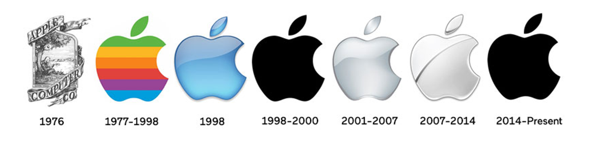
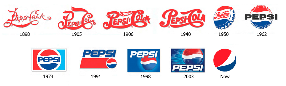
Monkey see, monkey do
Some of the most recognized companies invest time and research into rebranding. Witnessing the success of others’ rebrands tends to light a fire under us.

More examples of logo redesign: https://www.underconsideration.com/brandnew/
Industry standards for brand colouring
Whether you feel ready for a moderate logo update, or a large-scale, sweeping, in-your-face brand-o-rama, the standards are the same for both. What does it take to shine? What are the essential standards of logo redesign and branding?
The golden rules
First, your brand’s colours should never be altered after they’re established by the designer. Or course, using all-white, all-black or greyscale versions of your logo is perfectly fine, as is treating your logo as a watermark in the background of a marketing piece that complies with your brand’s pre-determined colour scheme (colour on colour). All business owners should possess high-resolution, vector artwork for their logo in full-colour, all-white, all-black, and greyscale. Caorda makes sure to include all of these colour varieties, in print and web formats, for all logo packages we produce. More about our branding »
As a brand encompasses more than just your logo, part of any successful marketing scheme ensures that the colours used along with your logo are always consistent. Even if your logo is just black, any colours used on your business cards, website, newsletter, stationery, magazine ads and more NEEDS to stay consistent. And that doesn’t just mean “always use blue”; it means “always use the exact same colour values of blue”, as there are literally THOUSANDS of them.
Taking even one step further, the colour values used for print pieces are not the same as the ones used for the web. If you’re a serious business owner, who cares about the consistency of your brand, you should learn the difference between CMYK and RGB.
Big no-no’s
Where colour goes wrong is when business owners miss the objective completely, deciding to alter the colours without consulting a design expert. Changing your logo from red to orange at a whim, just because you were in an orange mood that day, is not how it’s done, and it will come back to haunt you. You can’t suddenly decide to change your logo to green for the month of March in honour of St. Patrick’s Day. A good designer won’t make your logo pink just because it’s your favourite colour. (If your company sells lipstick or cotton candy, that might be appropriate; landscapers or auto mechanics, not so much.)
A horse of a different colour
If a logo is designed with the intention of being flexible, with ‘varying colours’ being part of the brand strategy, then it makes sense. Google customizes its logo for various holidays (Google Doodles), but this is one of their particular marketing strategies. They have changed their official logo several times over the years, but that’s after lots of time and research has been performed to establish what needs to be changed. And, although the font and spacing changes periodically, the ‘essence’ we know and trust remains steady. Changing the colours of your logo for a limited time, to commemorate a milestone or support a cause, can be trendy, although typically only large, well-known companies can get away with this.
To help give you an idea of the important role consistent colours play in the world of brand design, here’s a fun blog that shows you how some well-known logos might look if their colours were altered. (As a designer, this kind of messes with your head.)
It don’t mean a thing if it ain’t got that zing
Most successful brands have something a little special. If you sell shoes, it helps if you can incorporate a shoe into your logo somehow. Sure, slapping the image of a shoe beside your company name is one way to do it. However, if you find a way to include a subtle shape of a shoe within the lettering, you will impress more people. Buyers will clearly see that you have pride in your company—enough to give your brand some serious thought—which might help them choose your product over the competition. Here are a few examples of how others have used this clever tactic:
![]()
![]()
![]()
![]()
![]()
![]()
![]()
![]()
![]()
If you weren’t already aware of the cleverness of these logos, here are the secrets (some more obvious than others):
- Yoga Australia: the negative space in the middle creates the shape of Australia.
- Flight Finder: the company initials ‘FF’ create the shape of a plane.
- Le Tour de France: the letters create the shape of a bicyclist.
- FedEx: negative space between ‘E’ and ‘x’ creates a forward arrow.
- Toblerone: hidden in the pattern of the Matterhorn Mountain is the shape of a bear, the symbol of the company’s city (Bern, Switzerland) to symbolize their origins.
- Formula 1: uses the negative space of the ‘F’ to create the ‘1’. Also, a few simple lines help convey ‘speed’.
- Beats: the letter “b” represents a side-view of a person wearing headphones.
- The Guild of Food Writers: negative space in the fountain pen tip creates a spoon.
- Amazon: smiling face, from ‘A’ to ‘Z’.
The best type?
Your brand’s fonts/typefaces should be used the same way in all of your marketing materials. This means that, not only must you stick to the same font category (serif, sans-serif, script, hand-drawn, etc.), but you also can’t swap-out one font for another, even if it’s in the same category and looks quite similar.
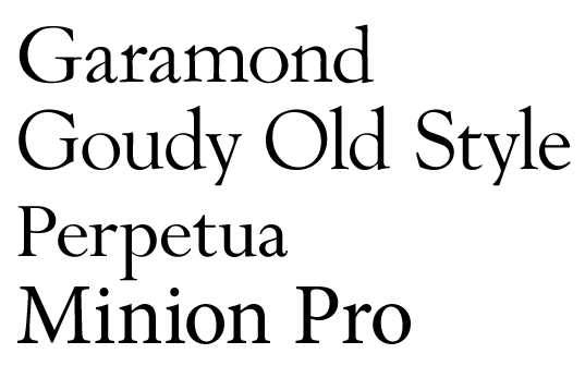
Typeface plays a large part in brand recognition. If your logo is a wordmark (such as the Coke logo), typeface can play an even bigger part. Typeface can instantly give a feeling about the product. Is it dramatic? Playful? Trustworthy? Old-fashioned? Conservative? Alluring? Wild?


We’ve got you covered.
If you’re ready to get started with your very own brand makeover, give us a shout! If you’re not sure if you’re ready, check our blog again in the coming months, as we plan to continue sharing more useful information on this topic.
Whether you think it’s time for a brand refresh, or a completely new corporate identity, we’re here for you. We’ve helped develop (or fix) the brands for business of all shapes and sizes, from small local startups to century-old, multi-city corporations. If you haven’t given much thought to your brand for a while, and just need some advice from someone with years of experience, give us a call!
Learn More About Branding Brands We’ve Created Get In Touch!