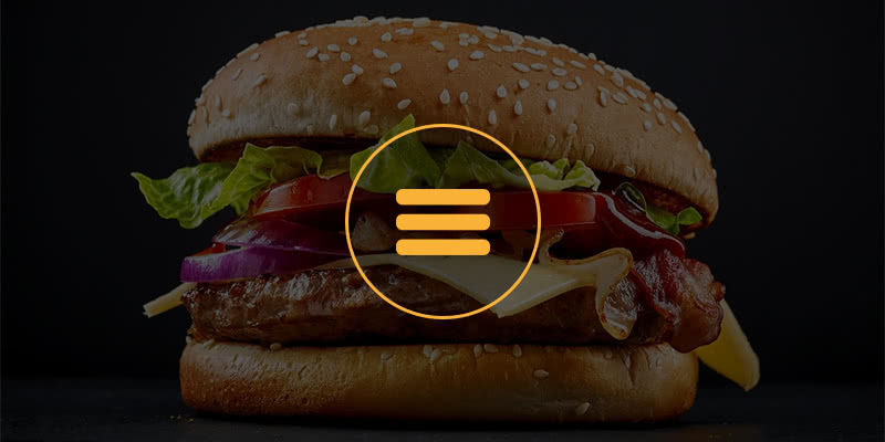
Hamburgers. They’re everywhere. But we can assure you that this article has nothing to do with your favourite fast food sandwich. The grade-A issue we’re referring to here is the ‘menu list’ icon (or ‘hamburger’ icon) commonly found in the top corner of mobile websites. This stack of 3 horizontal lines, somewhat resembling a hamburger (or veggie burger), has become a commonly recognized icon, found on the majority of modern mobile websites and apps.
 This icon first started being used in 1981, on the Xerox Star, the world’s first graphical user interface designed by Norm Cox. (Yep, we do our research.) Picture the days of the Apple 2, and a boring black and white screen where iconography was hugely important. “It’s graphic design was meant to be very “road sign” simple, functionally memorable, and mimic the look of the resulting displayed menu list,” Cox said when interviewed later about his idea for the menu icon, “With so few pixels to work with, it had to be very distinct, yet simple. I think we only had 16×16 pixels to render the image.”
Pass the Sauce…
 Loved for its simplicity, for the past several years the hamburger icon has been growing quite common. The reason they’re used, of course, is to convert a large space-hogging navigation menu into a single, cute, compact, and attractively minimalist button. The hamburger menu does save precious page ‘real estate’ on small screens.
Facebook is one company who helped push the popularity of the hamburger menu. These days, on responsive (mobile-friendly) websites, it has become common practice to collapse a website’s menu down to a single drop-down or slide-out menu, accessible by the ‘hamburger’ menu icon that you access with a finger tap.
Designers typically love their flexibility. Like other common user interface icons, hamburgers can be executed in various shapes and sizes, but it’s almost always the go-to icon designers include when designing a smartphone-sized website interface. Here’s a sampling of some common burger species offered by iconfinder.com.
Here’s a sampling of hamburger-infused sites we’ve personally developed…


So, What’s Your Beef?
Hamburger menu icons are becoming a big discussion topic in some UX designer circles these days, for multiple reasons, mostly stemming from their inconsistent behaviour, and due to the fact that not all people visually recognize it as a menu symbol – particularly those new to the world of mobile web searching. Some designers support the idea of pushing away from the generic mobile menu button, to make it easier for the ‘not so technologically savvy’ to find the information they need. Other good arguments include the ‘over use’ of the hamburger icon, which results in ‘dumbing down’ or ‘normalizing’ the art of mobile interface design. (Yawn.) We can be more creative than this, can’t we? The challenge is to develop a way to improve the page-navigating experience while making it more intuitive.
Some app designers feel that the hamburger menu lacks efficiency. Its prominent location on mobile apps – the top left corner – is the least intuitive spot on a mobile device for a right-handed user, and doesn’t encourage engagement.
Not all viewers intuit it as a menu button. Besides, hamburger menus occasionally have problems from a usability standpoint. Even if a viewer familiar with mobile website layouts automatically recognizes the icon as a menu button, they will be forced to study the menu that unfolds when they tap the button.
Web designers design drop-down and pull-out menus in a variety of ways, and a menu can be configured to open in a number of eye-catching ways: slide-down, left slide-in, right slide-in, fade-in, bounce into place… (you get it). Sometimes these menus expand in a way that creates confusion as to how to close them back up. Also, the fancier the effects, the better your chances are that the menu will not function properly, specifically on mobile devices running antiquated mobile web browsers. It would sure annoy you if tapping the hamburger button didn’t work, preventing you from accessing the pages of the website. (Where’s the beef?) And so, many sites smartly include an alternate navigation menu down in the footer that’s not dependent on fancy effects.
And why is navigation so important? Because the easier it is for the public to find what they need on your site, the more they’ll keep coming back, and tell their friends about you. The more visits your site gets, the better your search engine rankings will become over time. (To learn more about Search Engine Optimization, check out this other post: What is the Value of SEO?)
What’s the Alternative?

Twitter’s App Interface
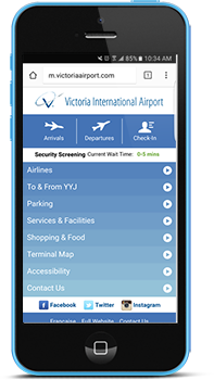
YYJ Mobile Site Interface
One trend we see occasionally is to have no menu button at all. The Victoria airport (YYJ) mobile website is a good example: on their home page, they list several menu item vertically down the page, taking up the whole screen when you first arrive – a good tactic to help frantic travelers find what they need. (Hey, I’ve used it… Can’t remember if there’s a Starbucks on the other side of security? The answer is one tap away.) On all the other pages of their mobile site, the menu simply consists of the 3 or 4 most important pages, displayed horizontally across the top of the screen. Another important thing to note, in the case of the YYJ website, is that their ‘mobile website’ is separate from the full website (a trend that was popular several years ago but is quickly being phased out); the mobile one only includes the most commonly accessed pages.
Twitter’s app doesn’t use the hamburger icon, and you find your way around just fine, don’t you? (Hey, even questionable political leaders manage to get around!) In order to access the lesser important screens in Twitter’s interface, the image you upload as your profile icon is positioned at the top left of the screen; tapping it will slide-in a list of various other screen options to select from – topics relating to your account settings.
Hamburger Addiction
A new trend has even come about recently to hide all navigation items under a hamburger menu even at desktop size. We’ve designed a few like that, and even our own website contains most of its menu items under a hamburger, while keeping some of the most common pages in the header at all times. Perhaps this helps to create more design consistency across various screen sizes, and allow more space on the page to accent the page content, but is the world really ready for this yet?
We Relish Your Feedback…
As a web and graphic designer, it’s always my top priority to deliver ideas that help give Caorda’s clients unique, attractive, original and highly-usable Internet solutions. I would love to hear your thoughts on this topic. Which navigation methods work best for you? Contribute your thoughts below. Do you like hamburger menus? Do you find them challenging to use? What do you think would be a better solution for a method of navigating through the pages of a website? Thanks for reading, and have a very happy holiday season! I look forward to hearing your comments – then we’ll talk turkey. :)