
First impressions matter. A lot.
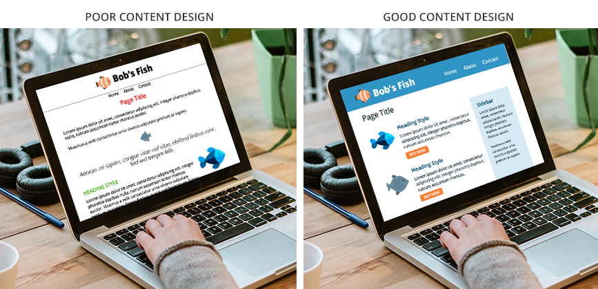
The single most important factor of a successful website is the layout of its pages. Without a great layout, you run the risk of your users finding it irrelevant – or not captivating enough to hold their attention. To keep them engaged, certain basic tactics should always be employed to ensure that your pages are interesting enough to capture and maintain attention; at the very least, dispersing relevant and unique images and headings throughout your page copy helps to visually separate your topics from one another. Also, incorporating obvious buttons and calls-to-action will assist your users with their journey though the website.
Page content needs to be relatable and intuitive in order to help spur consumer-business interactions. It’s important to help your readers feel personally connected to your subject and to find what they need quickly – which will keep them interested long enough to register a conversion (for example, purchase a product, submit an inquiry form, click an ad, etc.).
Appeal
One of the most ineffective and unattractive ways to lay out page content is to use long strings of full-content-width text. Not only will your visitors find your content difficult to read, they will also find it unstimulating. Sure, injecting images between some paragraphs is a good first step in improving page appearance, but there are several other commonly used tricks you can use to improve visual appeal, including the use of attractive heading styles, text wrapped around images, two- and three-column layouts for different sections, sidebars (for secondary information), eye-catching quotes or testimonials, and alternating bands of colour to help separate topics.
“Design is intelligence made visible.”
—Alina Wheeler, author
Clarity
Clean, organized and dependable user interfaces convey trust. They make visitors feel welcome, making them more inclined to return to the site to see future updates.
First and foremost, every website needs a clean, easy-to-follow navigation system. If visitors can’t intuitively find their way from one page to another, they get agitated, lose focus, and leave immediately. A usable webpage layout is simple to follow and gives visitors clear access to valuable information.
Almost every successful website presents its information in a similar way, with highly important, commonly used information in plain sight on the home page and at the top of all pages of the website, presenting easy ways to get in touch or make a sale. While not every website showcases its offerings in the same way, effective companies utilize a high level of clarity to help users find what they need.
For example:
- If you want users to consider making a purchase, the ‘add to cart’ button should be in plain sight at all times.
- When browsing a company’s news or blog section, it should be easy to navigate to other topics with one or two clicks.
- If you offer hundreds or thousands of products for sale, a search button definitely needs to be clearly accessible at all times.
- If you allow ads to appear on the pages of your site for monetary gain, pay careful attention when deciding where they will appear; they should be obvious yet non-obtrusive.
Traditional graphic design rules should always be implemented. For example, a minimal number of fonts should be used throughout the entire site. Each page should use consistent heading styles and sufficient white space (padding around elements) to assist with easier information interpretation. Text should not be centered unless there’s a very good reason for it and a small number of colours should be based off those belonging to the company brand (and definitely no for-the-heck-of-it exceptions!). Also, all of the imagery within a pager region should be sized similarly and line-heights (line spacing) should stay consistent across all paragraph and all pages.
Consistency is key: all page titles should appear in the same spot on all pages; the header and footer regions should look the same on all pages; buttons and links (and their hover states) should always have the same look and feel; the company’s logo and colours should be used cleverly to help visually break up the space and support brand recognition.
Usability
If your site is easier for the public to use and it’s easy to read, and with clear distinction between page regions, chances are pretty good you will have more success selling your product. Users rely on calls-to-action to accomplish what they need to do; buttons such as ‘Read More’, ‘Sign Up’, or ‘Buy Now’ – as well as attractive feature boxes integrating appealing imagery and easy-to-use web forms – are key factors in successful websites that guide people through a multitude of pages to the right destination.
Your home page should consist of plenty of optimized page copy related to the most important parts of your website – and ideally that copy should be analyzed and improved by a search engine optimization specialist before the website is made public. Gone are the days of text-free, photo-based intro screens. Your home page needs text — lots of it — attractively laid out with the more pertinent information as high up as possible. Any subject matter considered to be of little value to your sales does not need to be there. Is a slideshow going to help sell your product? If you are selling art, maybe. If you sell circuit boards, probably not.
For the sake of usability, familiarity and trust, there are still places on your website where pages should have the exact same layout. For example, all blog posts, as well as all product pages, should be immediately recognizable as such. However, when it comes to designing the layout for your ‘About Us’, ‘Services’, or ‘Contact’ pages, a little well-planned creativity will score you tonnes of brownie points.
Lastly, who visits your site? Are the pages of your site designed in a way that appeals to their specific taste? Is your audience old or young? Are your users working professionals or fun seekers? Students or teachers? Big spenders or budget watchers? It is tremendously important to maintain brand consistency for all the ‘meat’ in between the header and footer – for all pages.
“The function of design is letting design function.”
—Micha Commeren, designer
Value (and Planning)
Successful website design begins with the client supplying a designer with as much content as possible for all the pages of the site. The reason for this is to help give the designer an idea of how much length and width to account for, how much white space might be necessary to help with visual clarity, which page regions might repeat on multiple pages of the site, and which sections will deserve greater visual distinction than the others.
Think of it this way: you never instruct your architect to “build me a house”. You need to tell them how many rooms you require, how large each room should be, which side the front door should face, and whether you need any special considerations. Nothing comes from nothing, and so the more direction you provide, the better your final product will be.
If you wait until after your website is completely built to send your development company content for all of its pages, they may encounter things that were unexpected, including pages and regions that would strongly benefit from having alternate layouts, which may result in a need for additional development time that was not accounted for at the beginning of the project. Your project manager works closely with you to establish a budget for your site. That budget takes into account all the work that will need to be done to make your content shine.
To learn more about the planning process, read Trish’s post about Project Requirements.
Yes, it will cost you more to have multiple inner pages mocked up for your website, all with the content presented in different ways. Graphic design is an investment, but a highly valuable one. A decade ago, it was quite common for websites to stick to a single layout for all of its inner pages. However, these days – with such easy ‘drag and drop’ capabilities built into most website themes (WordPress and otherwise) – there is no excuse for letting the layouts of your inner pages go by the wayside.
“Design adds value faster than it adds costs.”
—Joel Spolsky, web programmer, writer, and creator of Trello
Success
Websites with clean, attractive and visually distinctive page layouts are more enjoyable to read, and your users will spend more time on them. Further, if nothing looks ‘broken’ or out of place, you more easily gain trust – and trust cannot be overstated when it comes to securing a sale.
When users enjoy being on a site, they will spend more time there. If they find the content enjoyable to read, they will visit more of your pages – and the more time they spend on your site, the better Google will reward you with higher search engine rankings! It’s a win-win!
“Design is not just what it looks like and feels like. Design is how it works.”
—Steve Jobs, co-founder of Apple, Inc.
Thanks for reading! If you have any questions about how Caorda can help improve your content design, just ask us!