
Google page experience for desktop computers is an algorithm update that affects how Google ranks websites. It’s a fundamental part of SEO – Search Engine Optimization – that tells Google your website is not just totally amazing, it’s a great experience for your audience as well.
We’ll begin using page experience as part of our desktop ranking systems beginning in February 2022
-Google Search Central
It’s not often Google announces a broad algorithm change like this, so when it does, that means it’s important. The last time Google released such a sweeping announcement was arguably for its ‘Mobilegeddon’ update in April 2015, when the company started to officially give priority to websites that performed well on mobile screens – and punish those that didn’t.
So, what’s the story? Are you ready for the Google Page Experience? Pull up a chair and let’s chat.

Google Page Experience Defined: What Is It?
Google page experience is a ranking factor that Google will officially bake into its algorithm – the highly complex and mostly secretive system the search engine uses to determine how your website ranks for a given search – starting in February 2022.
If you want the quick version, specifically, it refers to these three core web vitals:
Largest Contentful Paint (LCP) – This is the time it takes for the biggest piece of content on your website to load and for viewers to interact with it.
Cumulative Layout Shift (CLS) – This measures how much your website’s content, including fonts, images, buttons and videos, shifts while the page is still downloading.
First Input Delay (FID) – This refers to the time it takes for your visitors to successfully interact with one of your website elements, like a link or button.
That’s not an exhaustive list though – there are several other website design and development factors that make a good Google page experience, according to you-know-who (hint: Google), and we’ll discuss those later in this article. But, these three core vitals appear to be the basis of Google’s attention for this upcoming algorithm update.
This is a Desktop Algorithm Update
In a recent study from Statista, nearly 55% of all internet traffic is from mobile devices. Why then, is this algorithm targeting desktops only?
Several reasons really. First, Google already factors these vitals into mobile search ranking. That’s because it’s generally more difficult to optimize a website for mobile than it is for desktop. Google appears to have been looking at these vitals on mobile long (several years) before they announced this algorithm for searches that show desktop pages.
Second, that 55% number is a moving target. As we saw over the past 18 months, a lot more people are now working from home than in previous years (thanks for that, Covid-19). Laptops are mobile, in case you were wondering. And that leaves anywhere from 30% to half or more of all searches being done on, yup, you guessed it, desktop computers.
How to Prepare For Google’s Desktop Page Experience Algorithm
This algorithm measures your website’s page experience on desktop computers. It’s important to your visitors’ overall user experience, which Google has long stated should be the basis of your SEO efforts.
It’s bad to stuff an article full of keywords for a little Google mojo. It’s good to serve your readers with an informative, value-packed website that loads quickly, is coded well and doesn’t show a bunch of gobbledygook on the viewer’s device 20 seconds after they arrive at your website.
With this in mind, much of the Google page experience algorithm means you’ll need to be a little comfortable with the tech-ish site of your website. Are you cool with that? Great, let’s proceed. Does that make your knees weak? Reach out to Team Caorda – we build fast websites for a living.
#1 – Make Your Page Load Faster – For Largest Contentful Paint (LCP)
Websites are like humans. They’re prone to getting a little, um, prone to bloat as they get older. Images, videos, block elements with text and even your server can all make your website sluggish. That effect is even more pronounced if the design elements of these factors are located ‘above the fold’, meaning it’s the first thing your visitors see, without having to scroll down.
How then, can you make your page load faster?
Action Step: On the server-side, speak with your host about a larger plan – they’re often faster. If you’re on WordPress, be sure you’re running the most recent PHP version. You can also compress your images and text elements, look into website caching and pre-load some of your elements, possibly with a Content Delivery Network. There are dozens of other ways to speed up your website so take your time and do it right.
Related: Check out Caorda’s SEO Site Audit for a list of factors that we can analyze for you.

#2 – Focus On Your Layout Shift – For Cumulative Shift Layout (CSL)
Isn’t it frustrating when you land on a site, go to click a link or video, but another element (like an image) is still loading, so it pushes you away from the element you wanted to see? That’s Layout Shift, and your readers hate it. Google doesn’t like it either. Think about it – theoretically, you could be trying to click a link, but the layout shift pushes you to click an Order button instead and then the dinosaur sounds fill the air. Rrraawrrr!!
You can address Layout Shift by doing this.
Action Step: If you’re on WordPress, look for dimensionless images, ads, videos and other elements, then add specific dimensions to the related HTML container elements. Pre-load your fonts too, which you can do by editing the code that loads in the HEAD of your website. You’ll need developer experience for most of these items. There are several plugins that will also allow you to pre-load fonts, and contribute to a better overall Google Page Experience.
#3 – Speed Up Your Interactivity – For First Input Delay (FID)
If you’ve yet to notice, website visitors have little to no patience for slow-loading pages. From Google’s eyes, you’re doing something wrong if your first input delay (FID) – the time it takes a viewer to successfully interact with one of your website elements, like a click, tap or keypress – is more than 100 milliseconds. That’s 0.1 of a second. I’d like to see how many websites out there pass that test. I bet it’s around 1% or less! Our own website has an FID of 7.4s. Ayeee!
Your FID is the first impression you give your readers. Remember that often-repeated mantra that you’ve got less than seven seconds to make a good impression when you meet someone new? It’s a lot shorter than that for your website, and that means all the elements on your site should be interactive, clickable and able to do their job pretty much right away.
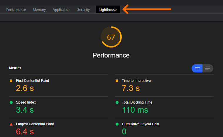
Nerdgasm Pro Tip: Use Chrome’s Developer Tools feature and click on the Lighthouse tab. That will give you a report on all of these geeky reports like FID and LCP!
Action Step: We’re getting into tech-ish territory when it comes to speeding up your website. But it needs to be done – page speed is a known ranking factor. To speed up your FID, you’ll need to minimize JavaScript and prioritize script loading so your most important elements load first.
You’ll also want to minimize long main-thread tasks – something WordPress in particular struggles with.
Don’t Forget About HTTPS, Intrusive Interstitials, and Mobile-Friendly scores
The upcoming Google page experience algorithm update appears to focus on LCP, CLS and FID. But these are just three of six known factors that comprise the Google page experience – that is, what makes your site worthy of Google to recommend it.
The remaining three factors are already built into Google’s mobile page ranking system. You’ll want to watch them on desktop as well.
HTTPS – A Default Security Layer
HTTPS stands for ‘Hypertext Transfer Protocol Secure’. It’s the secure version of the formerly used ‘HTTP’ and works in the form of a security certificate that has been issued by a legitimate host server, meaning the site you want to connect with – not a site pretending to be the site you want to visit.
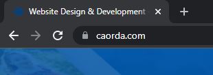
HTTPS sites are encrypted. You can tell if a site has HTTPS by the lock placed before the URL.
While not perfect, HTTPS is much more secure than HTTP. Google now expects your site to be HTTPS, and it may declare your site unsafe if you don’t have this security feature in place.
Action Step: Most servers offer a free SSL certificate with your hosting plan. Speak with your host to confirm this, then follow their steps to install it.
Intrusive Interstitials – Get Rid of Screen-Blocking Pop-Ups
An intrusive interstitial is something that blocks most, or all, of a mobile screen, which have much less space than a desktop. They can be banners or overlays like ‘welcome mats’, but most often they’re pop-up forms, which are effective for building an email list, but for Google’s page experience, well, they kinda suck.
They’re called “intrusive” for a reason.
Action Step: If you can, avoid pop-ups. Build your email list with opt-in forms within your content or the footer instead. If you can’t, make them as small as possible. Google’s John Mueller has suggested webmasters can use larger interstitials for direct traffic, and smaller pop-ups for organic traffic and Googlebot, which crawls your site.
Mobile-Friendliness – Not Applicable For Desktop But Still Very Important
In 2020, Google announced its mobile-first indexing policy. That means Google will predominantly use the mobile version of your content for indexing and ranking. It also means that it’s not ‘officially’ part of the Google page experience algorithm update that will roll out beginning in February – and it also means you should not ignore it.
Making your site mobile-friendly will often clean up the other page experience factors we’ve already talked about, from LCP to CLS and FID. And when you consider that mobile searches still comprise most internet traffic, you see why it’s important to look at all Google page experience factors – Mobile-Friendliness included.
Action Step: Your website should either have a responsive theme or two sites: one for desktops and the other for mobile. At Caorda, we generally suggest responsive themes, because they should work well on both devices, and assuming they’re coded well, should have few performance issues.
You’ll also want to increase your page speed, minimize pop-ups, compress your videos and images, avoid flash and use large font sizes, among other ways to help your site pass mobile-muster.

Moving Forward: Next Steps For a Good Google Page Experience
Think of your visitor’s user experience when they visit your site. Now look at the six factors we’ve just talked about.
Then, focus – not on trying to rank better, but on how to best serve your audience. That’s your job. And you can do that in the form of a website that loads quickly, is secure, doesn’t annoy your visitors and generally gives them a reason to stick around.
Google just showed you how to do that.
With that said, this is a tech-ish list, and it’s understandable you may need a little help. Reach out to us here on the Caorda team. We build websites for a good page experience, from start to finish, and we’re happy to give you our thoughts on how you’re doing.