When it comes to designing a killer user interface (UI), I like to think of it in three parts (or acts): the design, the functionality, and the user experience (UX). Carefully calculated user interface design is involved in all three, lending itself to the success of the product, which in turn helps drive traffic, provide quick information, and generate new leads.
User interfaces are the access points where users interact with designs. To design a user interface means to create a canvas in which the user can make clear decisions as they navigate through their process, with a focus on style that ideally helps strengthen the company brand. Web designers strive to create designs that users find easy to use and pleasurable. It can be a tricky balancing act, ensuring that aesthetic appeal and functionality are infused into every component of the interface, while placing the elements in an order that users or prospective buyers find intuitive and efficient. As the end goal of many interfaces is to deliver digestible information, streamline workflow, or drive sales, there’s no room for clowning around. (Yes, pun intended.)
Websites and Internet applications of the 21st century are fluid, organic and flexible, despite our old-school way of thinking. Sure, there are still some limitations here and there when it comes to how things function and behave, but when it comes to interface design (UI), the options are virtually limitless. People like having options, and they like control. An interface that allows them to locate what they need, and to make quick decisions, is the purpose of almost every web-based marketing platform.
UI design isn’t always about driving traffic and increasing sales; in some cases, it’s about achieving usability (ie. the user experience) for business processes or office automation. It’s also not only for public-facing marketing platforms, but sometimes it’s for internal applications, such as some of the internal project management tools our own company uses in-house, which are critical to helping us manage the many moving parts of our projects and our individual workflow.
It’s up to us designers to take your ideas and breathe life into them on the screen; we not only need to understand how you want your customers to navigate through the pages of your website or app, but we also need to look several steps down the road, ensuring that the intended layout will serve its purpose as easily as possible, and in a timely manner – all the while integrating it into a canvas comprised of your brand’s unique fonts and colours.
When it comes to designing an interface filled with form fields, buttons and drop-down options, there are multiple ways to accomplish a goal, and there are good and bad ways to guide the user through the experience. Time is of the essence. No one enjoys spending several minutes of their day filling out screen upon screen of information. That’s where your web designer comes in. We envision the thought process from the customer’s perspective to foresee the decisions they might make along their journey.
Layout Consistency
The more consistent your user interface is from page to page, and from device to device, the more it helps build trust. For example, you wouldn’t place the menu on the left for some pages and on the right on others, and it’s a bad idea to change your image styles from page to page, or introduce new colours into the theme for a single page, just for the sake of making a statement. Things like that frustrate viewers and result in a loss of trust, which may prompt them to choose an alternate business with a superior online environment.
In addition to being consistent with how you position content across the pages of your site, you should also be careful to maintain consistency with your fonts, heading styles, and iconography. Website designers carefully choose fonts that compliment your brand, and deviating from those will diminish the quality.
Not Every Screen is Created Equal
You don’t design a home page layout for desktop computers in the same way that you design them for smartphones. For desktop layouts, you should always use a greater amount of white space (padding/margins between rows, columns, images and other elements). You need to give your desktop viewers a more comfortable environment, as they are typically people at home in their leisure time. However, in contrast, your website’s tablet and smartphone layouts should be far more compact and simplified, in order to aid shoppers on-the-go.
An Elegant Balancing Act
To help illustrate the importance of good UI, let’s take a look at the reasoning behind the pages of a basic e-commerce website. Just as a grocery store might try and predict how to lay out their store shelves – with colourful, fragrant products right inside the door when you walk in, and affordable ‘grab-and-go’ items lining the checkout lanes – an online store should have some of those same features.
Business profile:
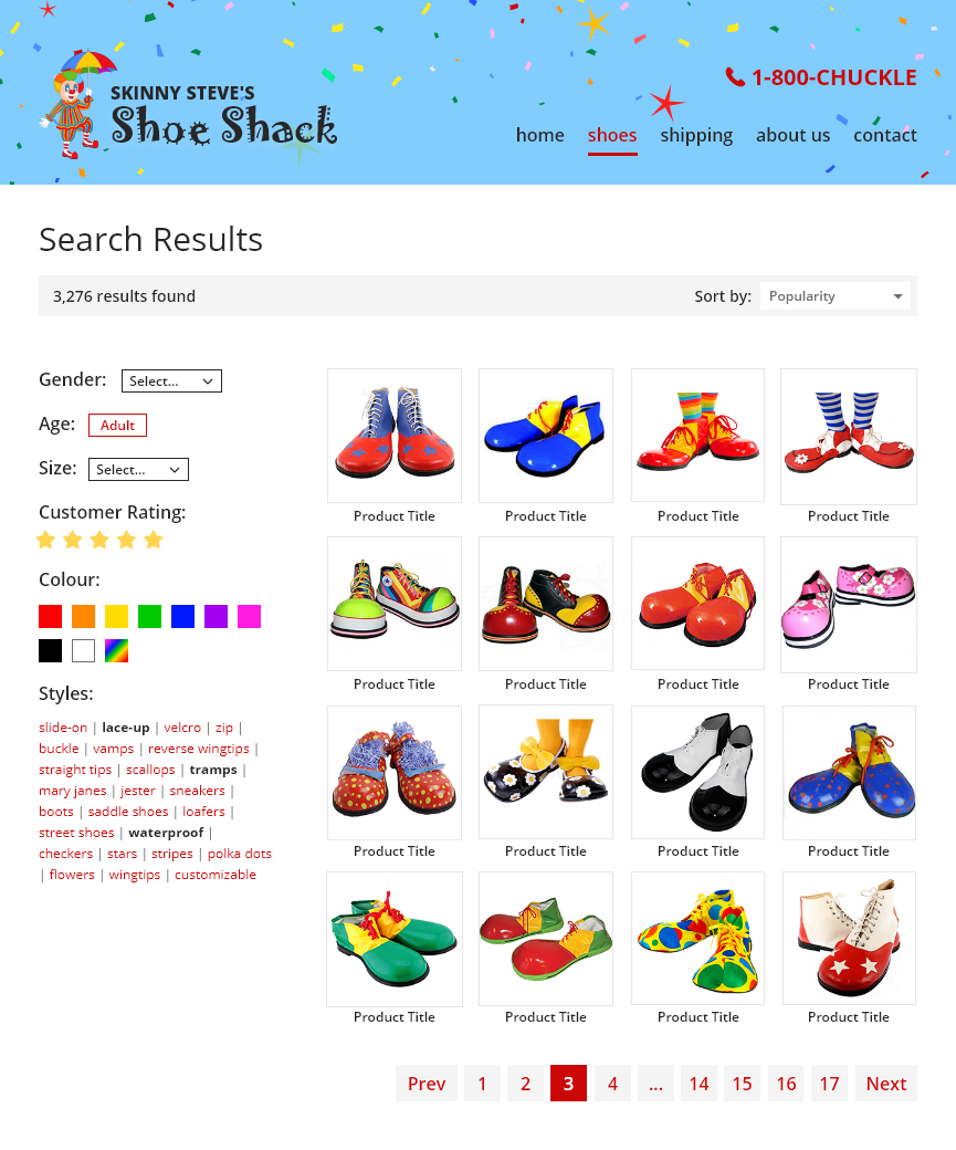
In this example, a business owner (“Skinny Steve”), having long since retired from his career as a circus showman, needs an online store designed to help sell his large, growing inventory of clown shoes. (Everyone loves clowns, right? Don’t worry, they terrify me too.)

With 300 styles and growing, his shoppers need to be able to search by multiple variables, and to be able to sort the results by price, popularity, and star review. And, of course, the quicker they find what they need, the more inclined they’ll be to make a purchase.
Customer profile:
Our shopper in this case—a well-seasoned clown, currently earning some retirement money by performing at private parties—is in the market for some red men’s shoes in size 10, with laces. He has an outdoor event coming up at a local farm during a month of unpredictable rainy weather, and so he needs something waterproof.

Now let’s play out an actual shopper’s experience…
Wireframing
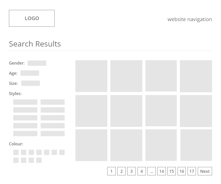
In some cases, it’s helpful to wireframe the page structure before getting wrapped up in distracting colours and styles. (When building a house, you start with a blueprint, not the siding, right?) The more search parameters we put in place, the quicker shoppers will find what they need. Also, limiting the number of results on a page, and paginating the results, will speed up page load time, feel less daunting to the shopper, and help them focus on the choices in front of them. Also, configuring the search results to automatically refresh on the page as each filter is toggled by the user reduces the number of clicks and tremendously speeds up decision making, getting them right through to the checkout screen.
Now let’s apply some of the client’s branding to the page, and show the search results with a few of the search parameters selected (age, star rating, and a few styles):
User interface design also comes into play when the shopper makes it to the product details page. Here’s where they make the ultimate decision to buy.
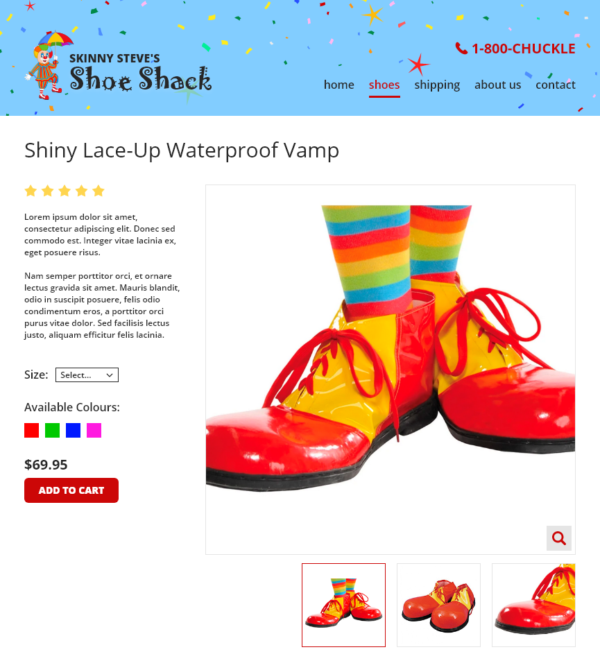
To ensure they are empowered to change anything they need before adding the item to their shopping cart, we need to provide them with one last opportunity to make any changes necessary. If this product comes in other sizes, that information should be changeable, as should the colour option. If more than one photo is available for the product, or a close-up available by zooming-in, it should be made clear that clicking those images or icons will have a result. Lastly, the ‘Add to Cart’ or ‘Buy’ button should ideally be the most obvious part of the product information on this screen.
Now let’s see how the search page would be laid out on a laptop screen versus a smartphone screen.
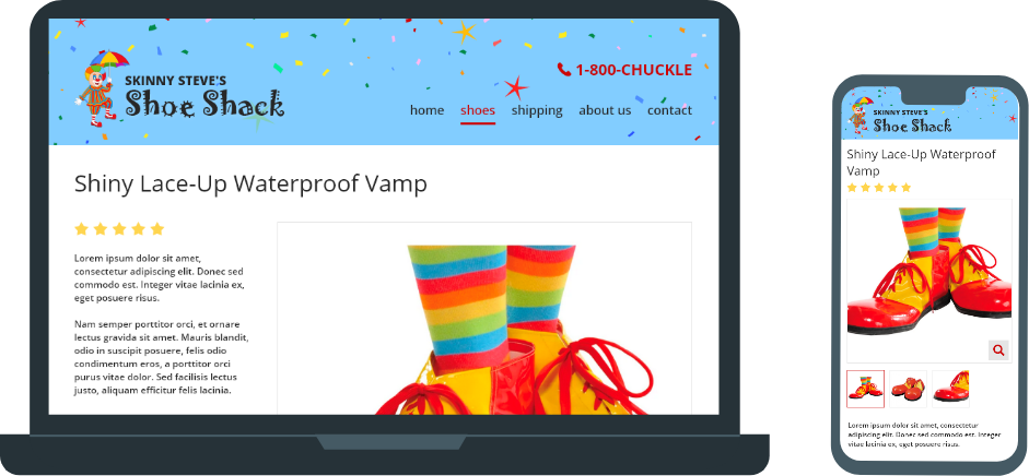
Looking ahead, not only to which pages come next in the purchase process, but how every page’s layout will adapt to all manner of mobile devices, is another key component of UI design. Understanding the trends, quirks and limitations of the mobile landscape takes time and patience to master. For designers who insist on absolute uniformity across all browsers, I’m afraid you are chasing a dream. Every browser displays fonts, line-heights and web forms differently; you’ll never get your design to match completely across all browsers and devices, but you can get really close. The ultimate goal is to ensure that all browsers and devices present a clean and streamline process, whether that process is buying shoes, signing up for a college course, contributing to a public forum, or designing your dream home. The steps all need to be clear and intuitive. That’s UI design.
Your Customers’ Initial User Experience
To streamline the search process from the moment a customer hits the home page of your website, we suggest adding some helpful category buttons right on the home page of the website, as well as a main ‘shop’ page listing all of the categories of merchandise. These sorts of calls-to-action (CTAs) will help get the shopper right into the shopping experience from the get-go. Secondary information (such as a blurb about shop owner’s remarkable history in the circus, or his fifteen pet poodles) is pushed down under the products.
Another tremendously important aspect of interface design is the placement of common page elements – that is, the things you see on every page of the website or app, and the things that exist on most websites. The business’s logo is typically placed in the top left corner of the header (sometimes centered), as western society is accustomed to reading from left to right. As the logo is the single most important part of a company’s brand, this is not something to try and alter for the sake of ‘being different’. Secondly, the website navigation is often placed in the top right of the header, or might span full-width, but typically in a horizontal bar, which makes it easy to convert it to a compact hamburger menu for the mobile layout. The top right is the most common place viewers look for the menu, and is the natural progression from desktop to mobile. Lastly, it is extremely important that each element on the page be given an adequate amount of spacing to help viewers hone-in on the information they need without confusing it with something else, not to mention allowing sufficient space for all sizes of fingers and thumbs to tap links and buttons on the screen. Learn about page content design…
 Thanks for playing!
If you have any questions about UI design, or any other important aspect of website and app design, drop us a line! Let’s see what we can do to help improve the user interface of your website or app.